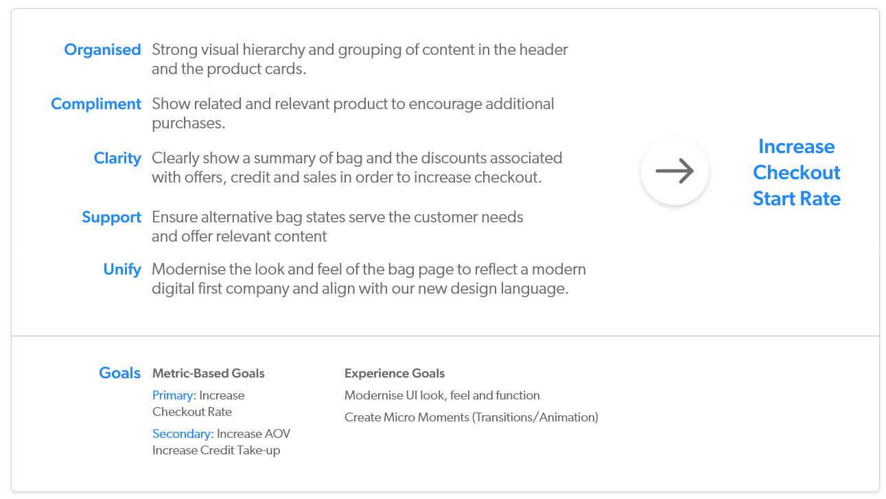
The bag experience on the FGH brand sites needed a redesign. It was outdated so needed to be restyled to match the new design language, accessibility needed improving as well as the general journey. The outcome of this redesign was to increase checkout start rate which would in turn, improve AOV (Average Order Value) and possibly increase take-up of the credit account. This was the first collaborative project I worked on in the UX team, with each member of the team working on a design pillar that was established at the end of the discovery phase.
Adobe XD • CSS
Much of the discovery had been carried out prior to me joining the team. However, I carried out my own research of the areas I worked on - the empty bag states and the bag flydown. I familiarised myself with the existing design and functionality as well as competitor sites.
We established 5 design pillars for the project that we would work towards and that supported the primary goal of increasing checkout start rate.
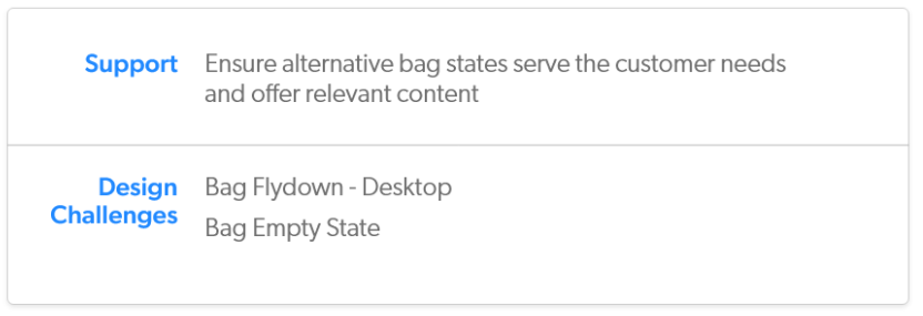
I worked on the 'Support' pillar where I focused on the alternative bag states - the bag flydown and empty states.
The analytics team provided some stats on visits to the bag page that we considered during the design phase.
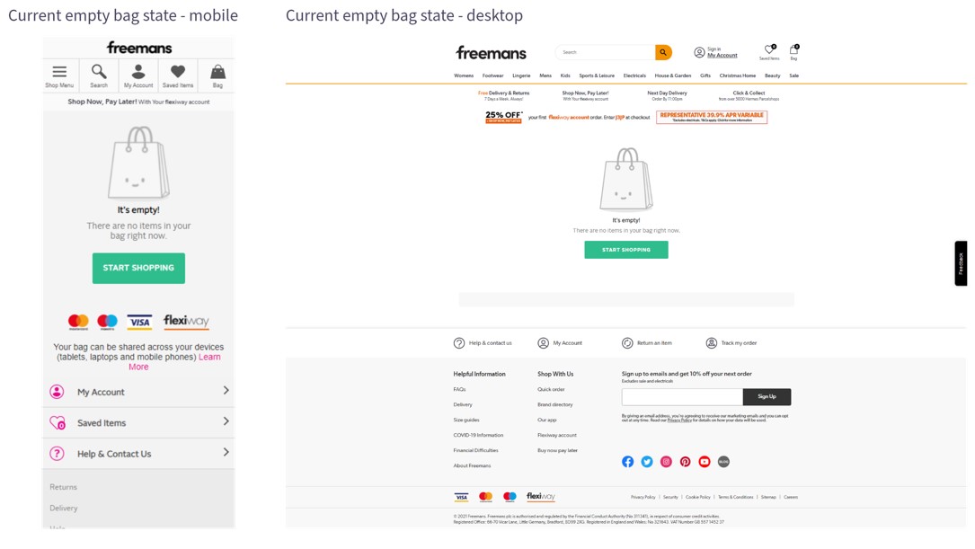
I looked at the existing designs that were on the live sites to analyse what needed changing.
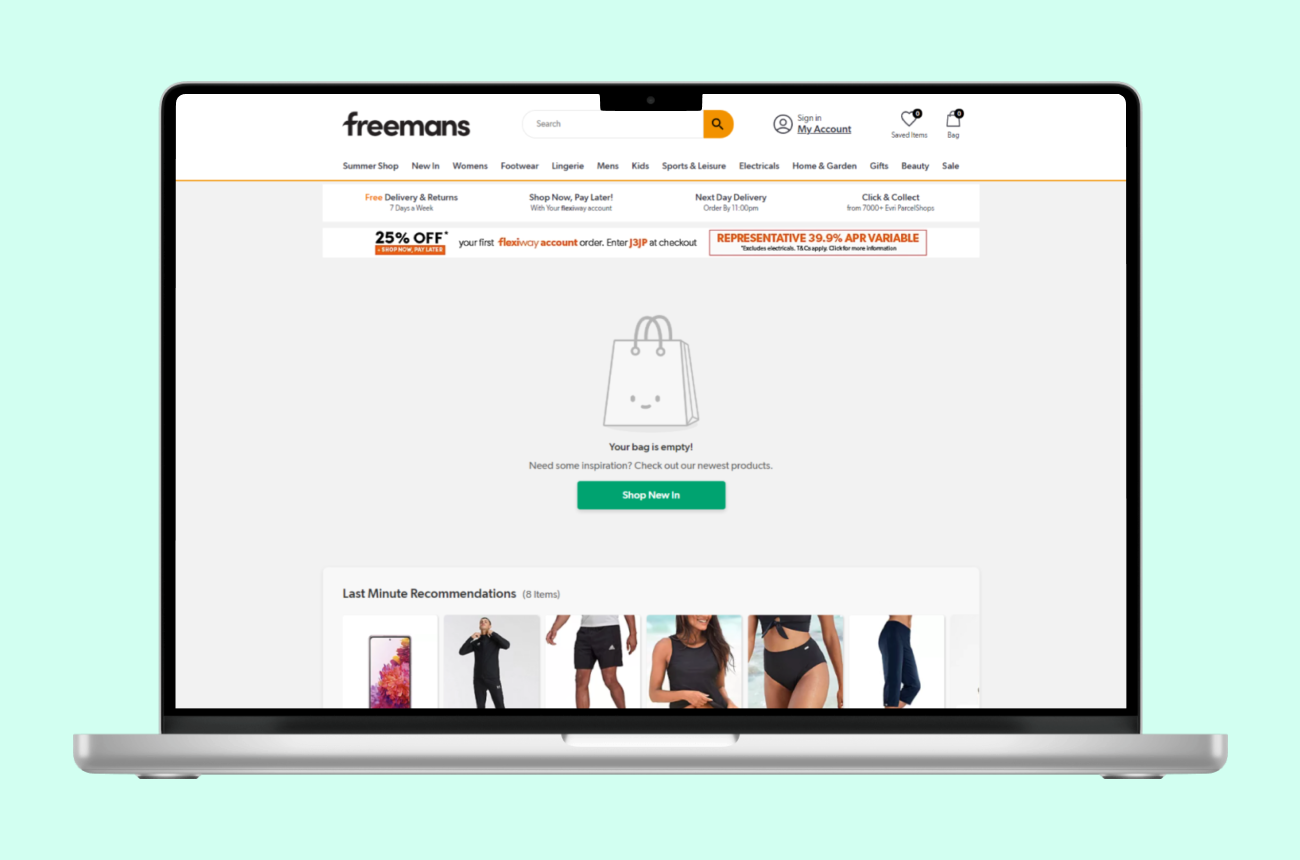
Noting the 6% of bag visits that see an empty bag, it was clear that customers must be expecting to see something when they click it.
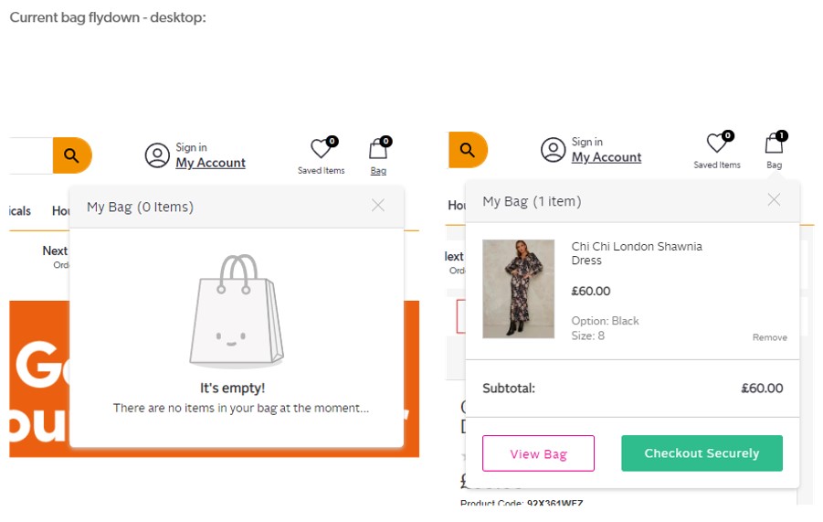
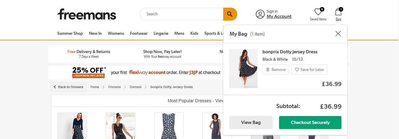
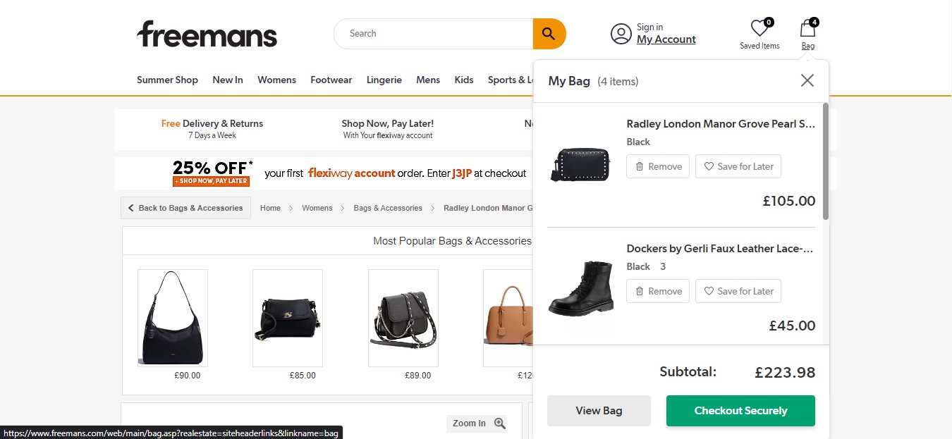
On desktop, a "mini" version of the bag appeared when a product is added to the bag or if the user hovers over the bag icon in the header. I looked into whether competitors used a bag flydown and whether there was a better way of indicating that a product had been successfully added to the bag.
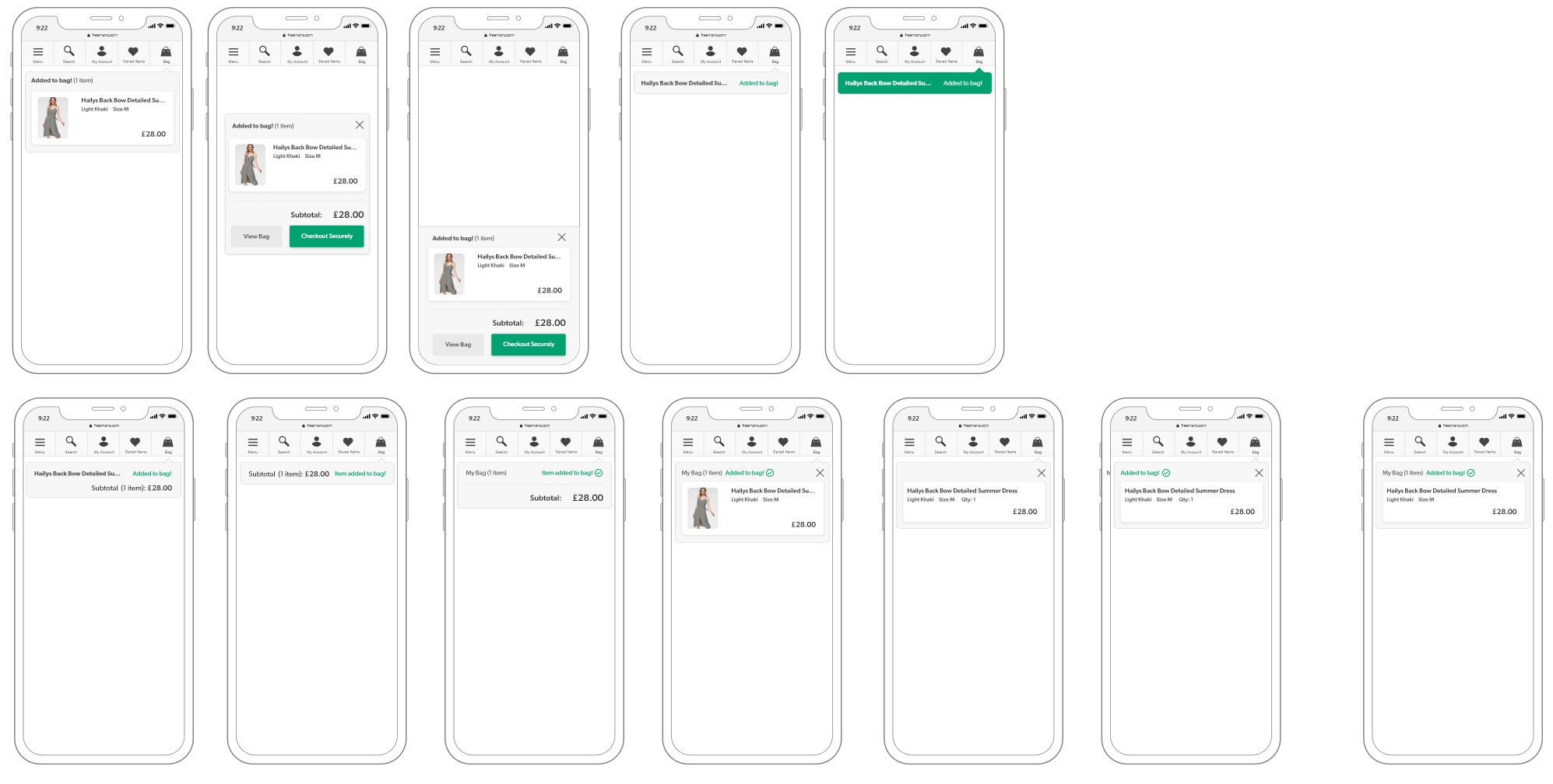
I also considered whether the same functionality could be implemented on mobile to maintain a consistent experience on all platforms.
The designs for this project were created iteratively with changes made after feedback during UX reviews with the whole team and occasional input from product owners and engineers.
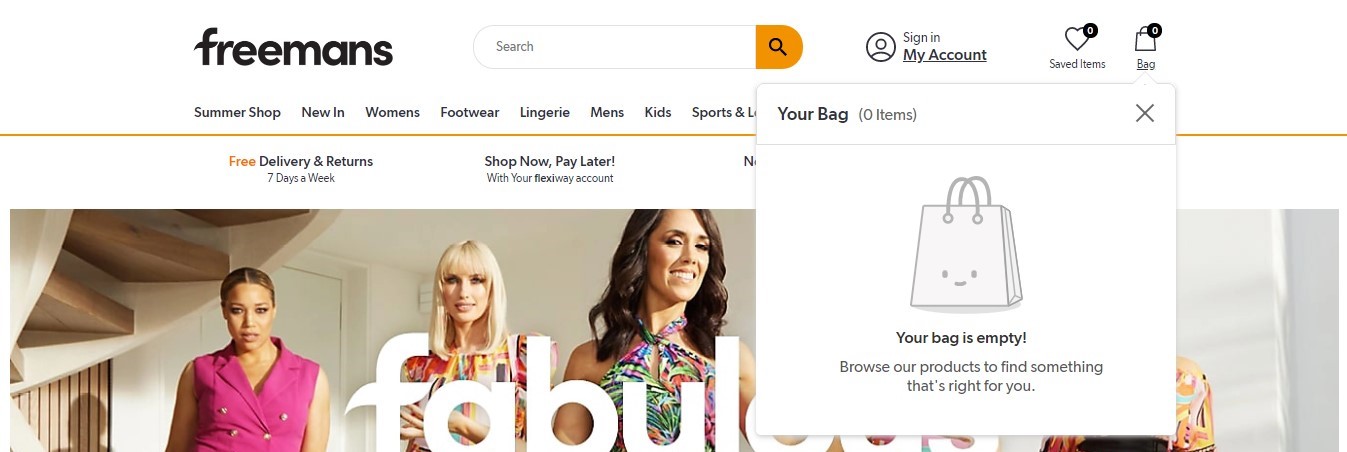
For the empty bag states, minimal changes were required as the goals of the states are to inform the customer that there are no products in the bag and to have a call-to-action to direct them towards products to browse.
I considered dynamically displaying different copy and call-to-actions depending on the type of customer and their cookie status. A new customer or a signed in customer with an empty basket would be directed to viewing 'New In' products which would hopefully inspire them to browse and purchase. A returning customer who was not signed in would be prompted to sign in if they expected to see products added from a different session. This would handle the customer expectation of seeing their added products, informs them as to why the bag is empty and what their next action should be.
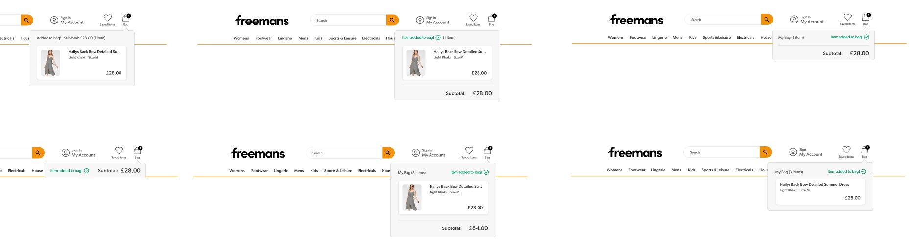
After carrying out competitor analysis, I noted that of the retailers that did utilise a "mini" bag on desktop, very few of them implemented it on mobile.
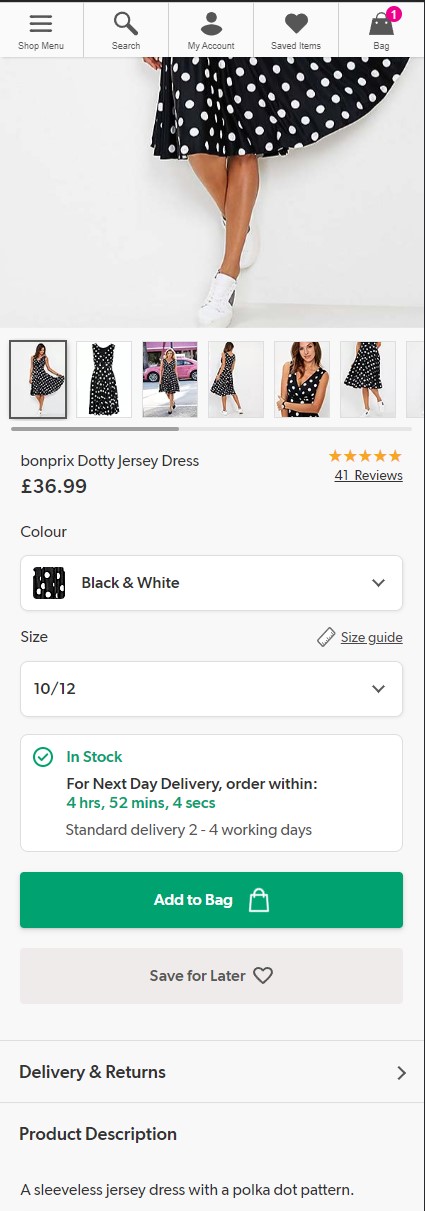
The main issue on mobile was that there was no obvious confirmation that the product was added to the bag. The call-to-action on the Product Display Page would animate to display "Added!" along with a tick however there was no further action shown to view the bag and checkout. The header on the page disappears when the user scrolls down so the bag icon was also not in view.
I considered variations on how the customer could be notified that the product had been added to bag without being too intrusive and disrupting their shopping experience.
I also considered implementing a similar functionality on desktop rather than keeping the bag flydown. This was because the flydown has limited functionality and I considered whether it would be more useful to just direct the user to the full bag page. It would also be clearer what product had been added to the bag, instead of seeing a few different products if the customer had already added some.
The solution designs were simplified as the general functionality of the empty states and bag flydown were appropriate. The main UX change was aligning the styling to match the new design language, bringing it into line with recent redesigns and maintaining customer confidence within the sites as they have a consistent visual experience.
The empty bag states were amended with improved copy and call-to-actions that changed dynamically dependant on the type of customer and their cookie status.
The cookies on the user's browser are checked on page load and the user is presented with one of the potential 3 scenarios.
The bag flydown functionality was retained on desktop but not transferred over to mobile. Again, the styling was updated to be aligned with the new design language.
The features on the desktop flydown were kept mostly the same. It allowed the customer to view products in the bag, see the subtotal, remove products, view the bag or go straight to checkout (only available on 3 of the brands). I added the ability to place products into 'Saved Items' for customers that were still considering purchasing but "not yet".
On mobile, the solution was to drop down the header and add a pulse animation to the bag count as it increases. Pulling down the header indicates to the customer where the bag is located and the animation confirms that the product has been added to the bag. The header also remains in view until the user interacts with the site again.
This was my first collaborative project so I learned a lot about working together to establish goals and making sure our designs aligned with each others.
I would reconsider my approach to the bag flydown on mobile. I considered some of my variations to be too distracting to the user but I feel that the animation is too subtle and may not be noticed. However, this design was implemented as it had to work alongside the existing 'Add to Bag' animation on the product detail page. If the design of the button was within the scope of the project, I may have considered altering the animation and having a more prominent confirmation appear.
Overall I'm pleased with my contribution to this project, I learned about the importance of iterative design and communicating with others who provide constructive feedback that will improve my work.