AJ Nails Collection is a small, independent nail polish business. The website needs a re-design as there are visual inconsistencies that interfere with the user experience e.g. repeated content and styling variations. An improved design could improve conversion rate as the main customer acquisition channel is social media, predominantly Instagram. It would also improve the SEO to increase traffic and expand the customer base.
Adobe XD • Adobe Photoshop
Research and analysis of the brand, competitors and current user experience.
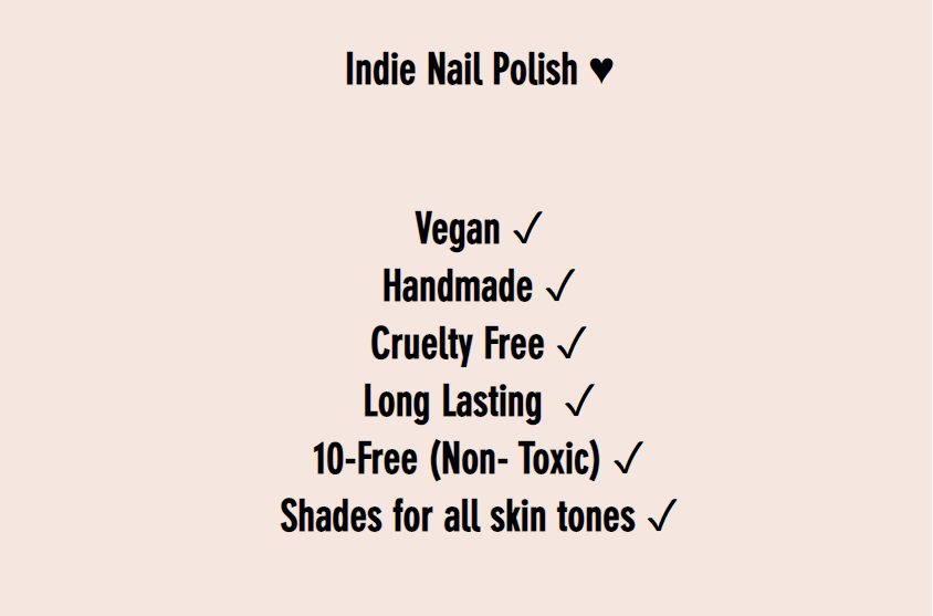
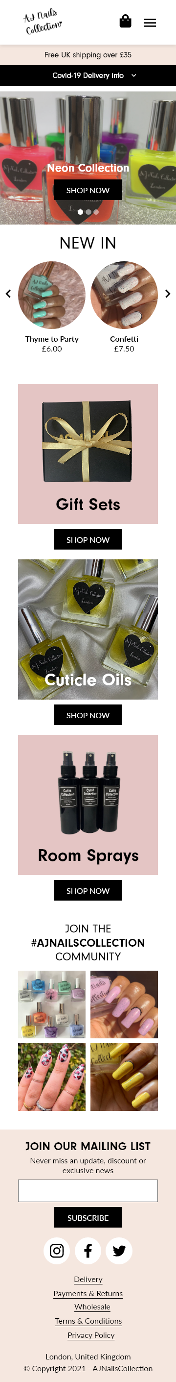
The unique selling points of the brand are highlighted on the homepage.
I used Facebook Insights to discover the customers that would be interested in purchasing from AJ Nails Collection.
Searching the terms, "Nail polish", "manicure and "cosmetics", I could determine that the audience would most likely be:
I also used SimilarWeb to look at traffic sources and search terms used to visit competitor websites.
Viewing the analytics for, OPI (opiuk.com), Nails INC (nailsinc.com), Kiara Sky (kiarasky.com), Ciaté London (ciatelondon.com)
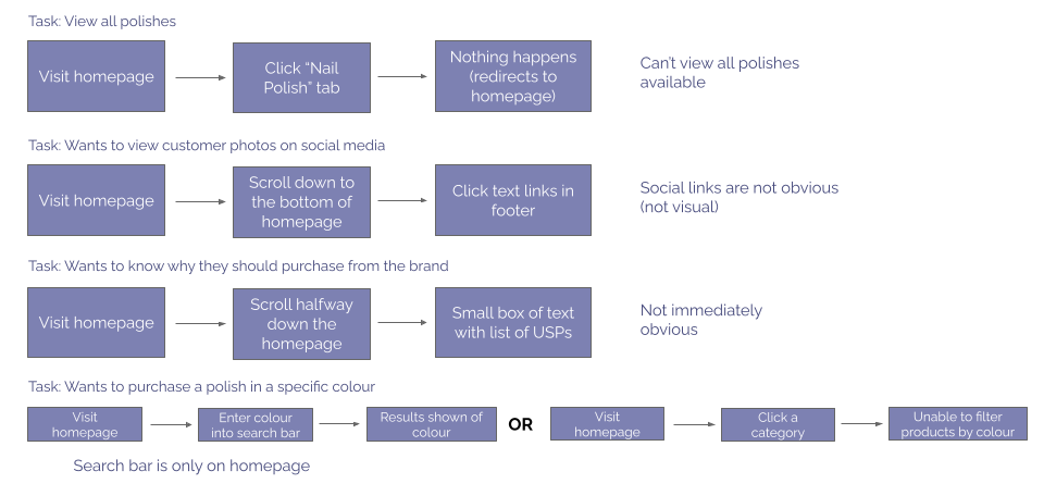
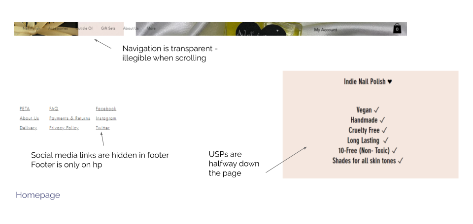
The main issues in the current user experience
I analysed the current website and outlined some of the tasks that a user might carry out, and what issues may occur on their journey.
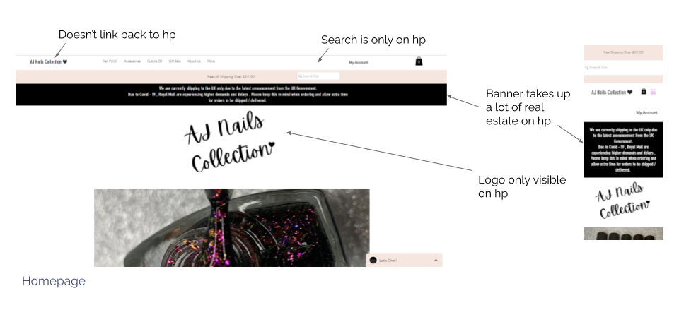
I also carried out an a visual analysis of the website, highlighting areas of improvements and where there is a lack of accessibility.
The website was re-designed with a focus on improved SEO, design consistency and site usability.
As search traffic is high for competitor companies, the re-design needed to consider how SEO could be improved.
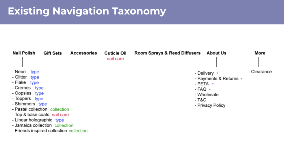
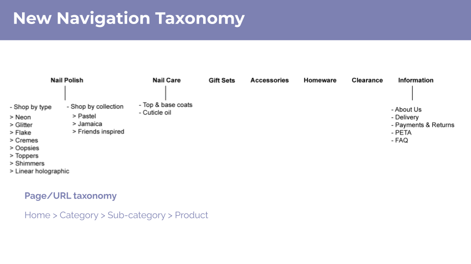
The site's taxonomy was reorganised to better reflect the information hierarchy. This structure was then used to within the navigation bar and can be used alongside the breadcrumb navigation to ensure consistency. Previously, there was inconsistency between the navigation, URL and breadcrumbs.
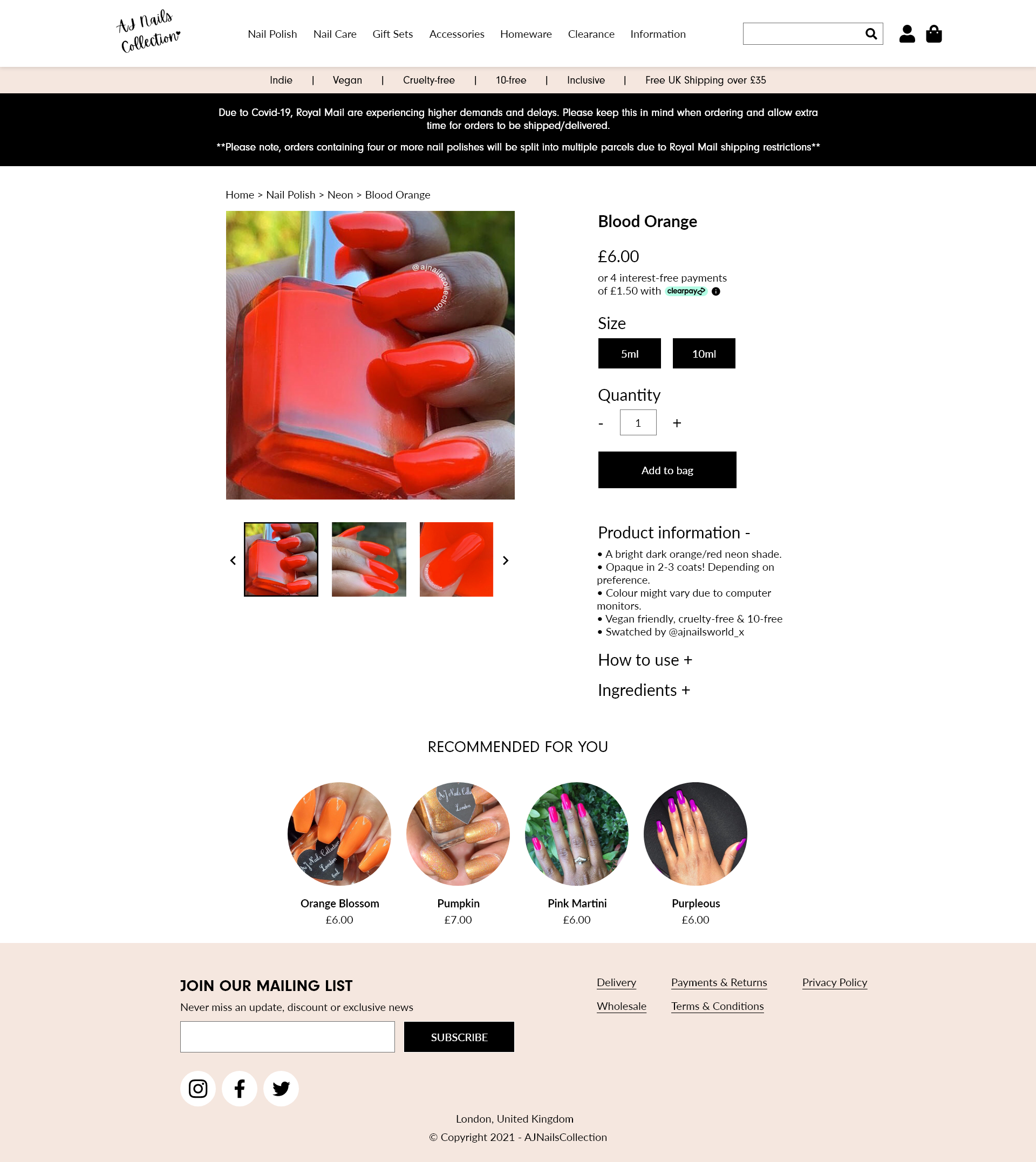
For example, the taxonomy of the product page for "Strawberry Sorbet", a glitter nail polish.
A uniform design was established across the site to reinforce branding and visually connect the pages.
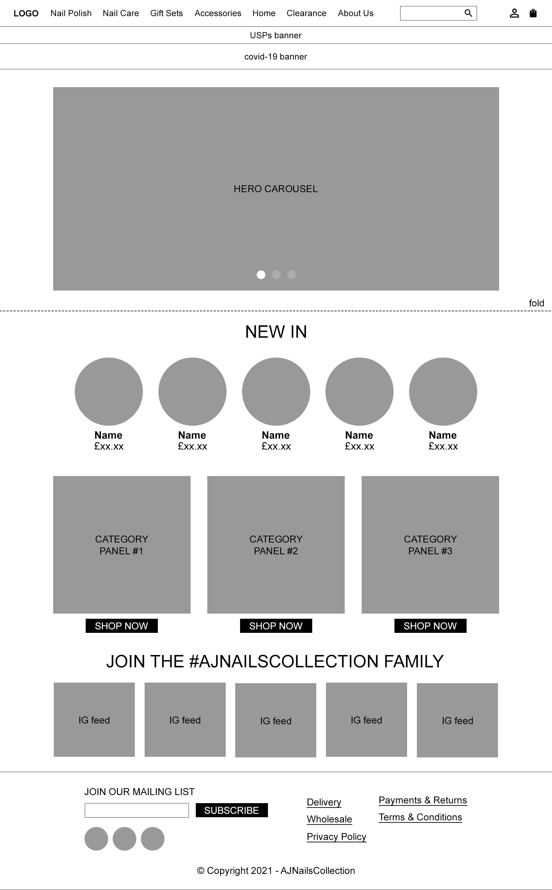
It was assumed that the site will be maintained by the business owner, by simplifying it into 4 main page types: homepage, PLP (Product Listing Page), PDP (Product Detail Page) and information pages. It would be easy for them to edit whilst keeping the style and layout consistent.
The order of content was either the same or similar on both desktop and mobile views to maintain consistency.
I created a wireframe of each page type to ensure I had considered all the elements on the pages and to help visualise the layout.
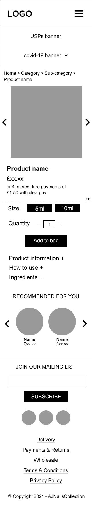
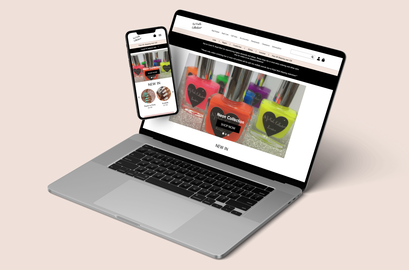
As a final solution I designed high-fidelity mockups of each page type and then created a simple prototype.
A prototype to demonstrate the re-designed navigation and page layouts, on both mobile and desktop.
I prototyped two user journeys: viewing a product and viewing the information about the brand.
A small user test was carried out with two participants to determine the effectiveness of the re-designed navigation.
Task: You're browsing on a desktop. You want to purchase 'Blood Orange' which is a neon orange nail polish, find the product page.
1st Tester -
2nd Tester -
Categories might not be organised correctly (neon could be type and/or collection) but it was clear which top-level navigation tab to select.
The re-design of the website was effective in achieving a consistent viewing experience for the user and strengthening the brand identity.
The new taxonomy could still be refined as there is confusion with language used for product groups however, the structure has been improved overall with the introduction of "category" and "type".